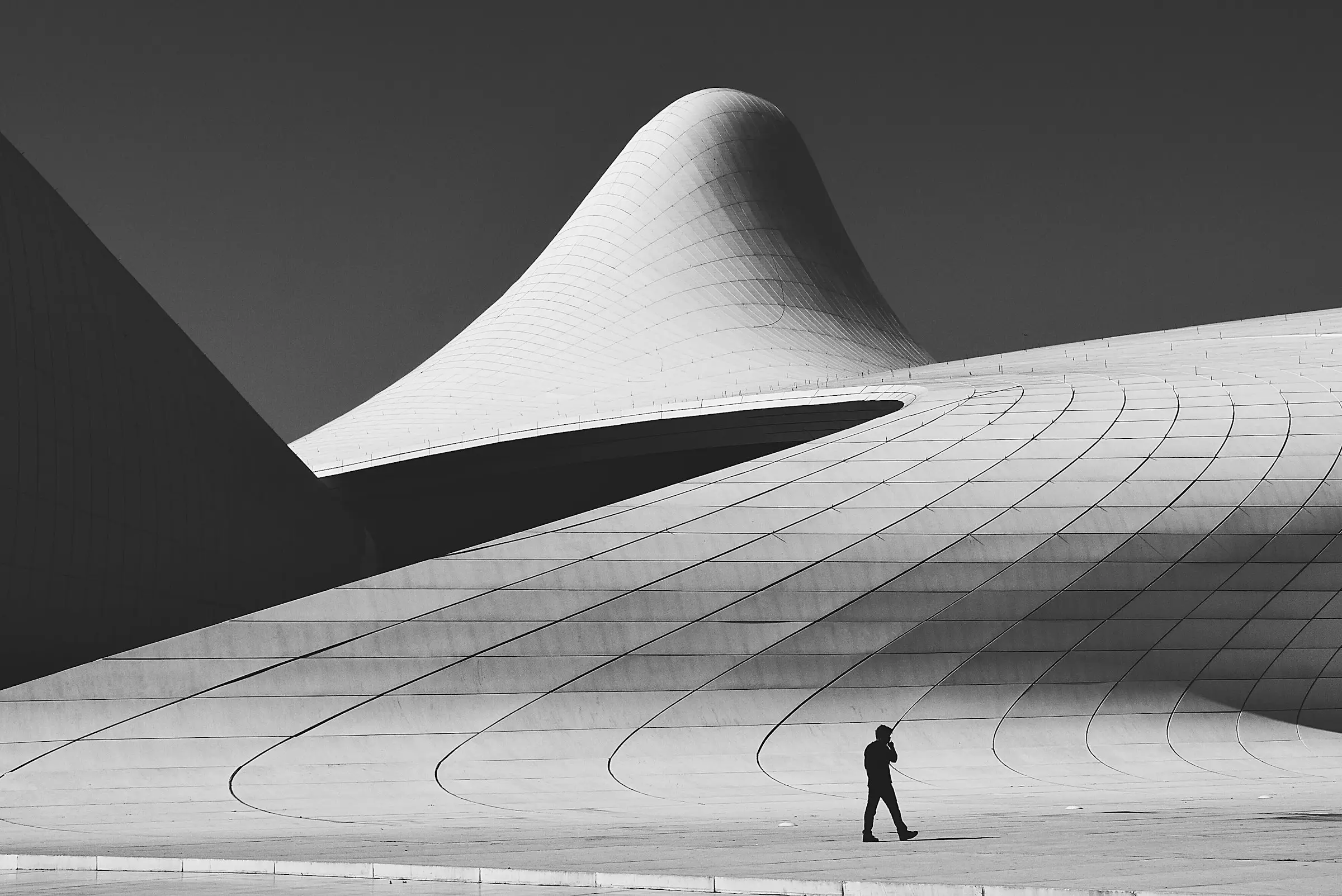
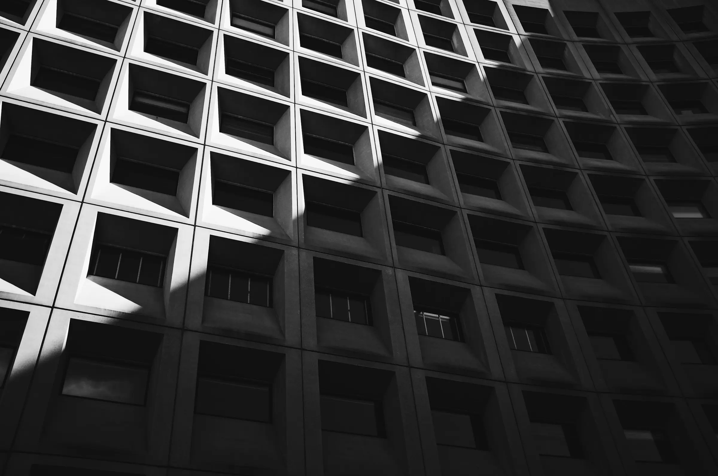
I took 1,400 photographs of the Register's buildings, so I wrote their alt text too. What a building's photograph should say to someone who can't see it, why "brutalist building" is not a description, and the four questions I asked of every picture.
The Register's building notes will be written by forty volunteers, a registrar and a retired architect, mostly on phones on the pavement. Their style guide had to fit on one page pinned to the office wall. Here is all of it, what we left out, and the first note that arrived.
The Register's plaques had a name and a year, in letters too small to read from the pavement opposite. The new ones are black enamel, set in small caps, and carry a code that opens the building's page. Prototyped on the press in the print shop, one line of metal type at a time.
The Register's old logo was a clip-art skyscraper in a city without skyscrapers. The new one was cut into stone in 1962, at the foot of the building everyone already associates with the Register. How we found it, redrew it, and kept it to one colour.
One question, asked of every field before it exists, does most of the work in our content modelling: who reads this value, and when? Here is why it matters more than it sounds, the index-card exercise we built around it, and what ends up in the pile.
The studio, its people, its clients and their 1,912 buildings are invented, to show what a site built on Nohead looks like. The projects, posts, people and images live in a Nohead project; Astro builds the site.