A wordmark from a foundation stone
The Register's old logo was a clip-art skyscraper in a city without skyscrapers. The new one was cut into stone in 1962, at the foot of the building everyone already associates with the Register. How we found it, redrew it, and kept it to one colour.
The Modern Register's old logo is a skyscraper. It is clip art from 1996, navy blue, slightly tilted, with a lens flare. It is on the letterhead, on the website, on the volunteers' lanyards and on a banner they bring to Open House every year. Dublin has no skyscrapers. Úna has been apologising for it for eighteen years.
Nobody was attached to it. That made the job easier, and also harder, because there was nothing to keep.
Looking for letters
I don't like starting an identity with a blank page. Most good identities are found before they are drawn, in the place the organisation already lives. So I spent a week walking the Register's buildings with a sketchbook, looking at letters.
Twentieth-century Dublin has wonderful lettering, most of it unnoticed: cast aluminium on church doors, mosaic on swimming pools, raised concrete on a 1950s school that says BOYS over one door and GIRLS over another. I drew a lot of it. None of it felt like the Register's.
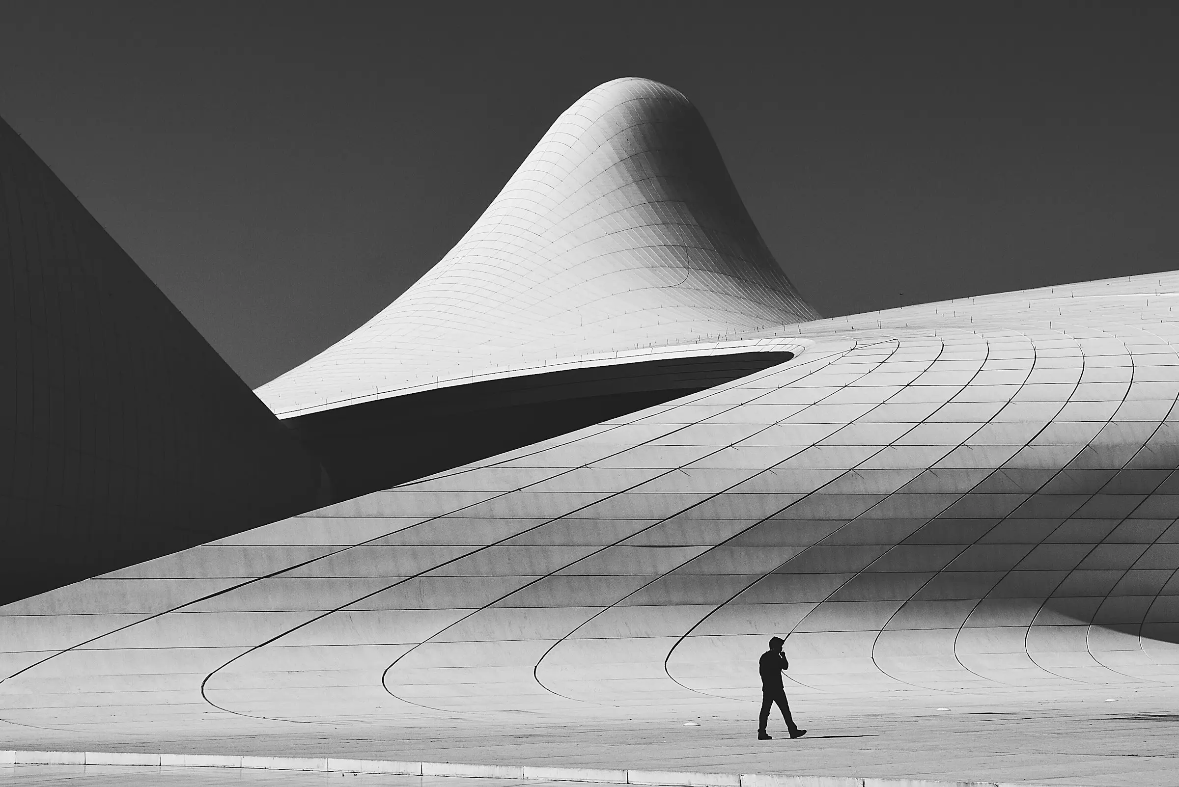
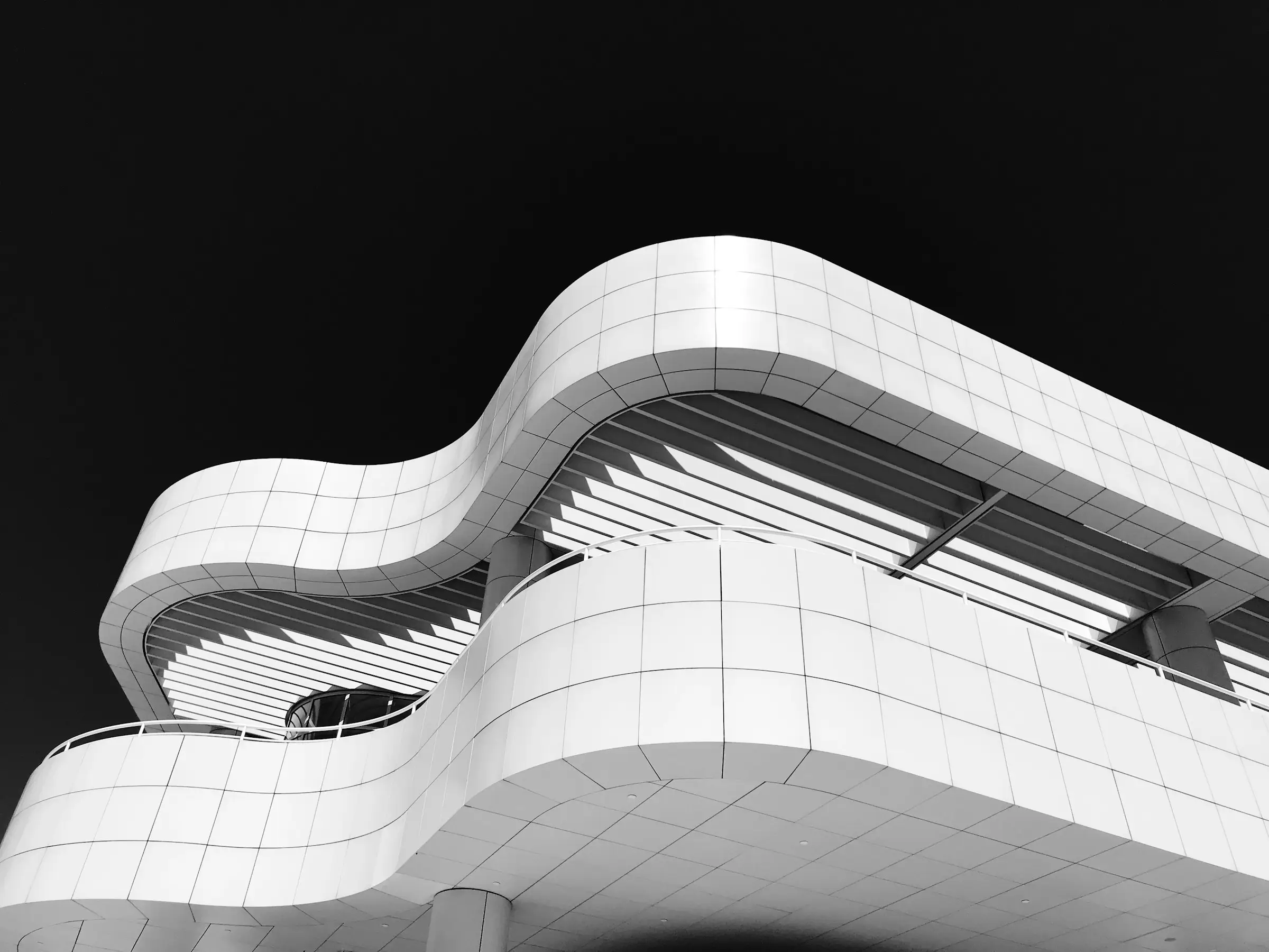
Then Sorcha took me to the bus station on the quays, the one in the photograph on the Register's stairs. Next to the entrance, under the lowest fold of the roof, there is a foundation stone. It says:
This stone was laid on 4 May 1962
The letters are cut into limestone, wide and open, with a slight flare at the ends of the strokes. Somebody carved them by hand, probably in an afternoon, and they are perfect. Everyone who walks into the bus station walks past them, and almost nobody reads them.
That was the Register: a city's buildings, made with care by people nobody remembers, waiting for someone to stop and read them.
Drawing it
The stone gave us about half an alphabet. From it I drew REGISTER in wide capitals, for the places the full name won't fit, and THE MODERN REGISTER for the places it will.
The hard part was keeping the carving without copying the stone. Cut letters have a V-shaped groove that catches light, and you can't print light. So I kept the proportions, the width and the flare, and let the groove go. The result looks drawn rather than carved, but you can see where it came from if you stand next to the stone and look.
I made one change on purpose. The G on the stone has a spur that curls inwards, like a carver's flourish, and at small sizes it fills in. The new G is plainer. Declan noticed within a minute and has forgiven me, mostly.
One colour
The old logo had four colours, including the lens flare. The new identity has one: black.
It wasn't an austerity decision. The Register's buildings are concrete, steel, glass and stone, and the photographs of them are black and white. The plaques are black enamel. Anything else would have been decoration, and these are buildings that were proud of having none.
There is also a monogram, a square R, for the places a wordmark won't fit: the website's icon, the corner of a plaque, the back of a lanyard. It is the R from the stone, set in a square the proportions of the bus station's roof panels. Nobody will ever notice that, and that is fine.
What's next
The wordmark goes on the new plaques next, which have to be read from across a street, in the rain, by someone who has stopped for exactly five seconds. That's the next post.
The skyscraper is retired. The banner has been rolled up and put in a cupboard in the Fennell Quay office, and Úna says it is staying there, in case anyone ever needs reminding.